This post gives a brief introduction to colour and its representation on computer screens and printed materials.
Fact 1: Screens display colour in a completely different way to printed colour.
Virtually any screen, whether it’s on a computer, a TV, or a phone, displays colours by showing lighting up sets of three tiny dots in bright Red, bright Green, and royal Blue — RGB. When all three dots are fully lit we see a white pixel on the screen. By adjusting the amount of light, different colours can be produced such as lilac with half intensity of red, no green, and full blue.
Printed materials, on the other hand, don’t purposefully shine light into your eyes: the colours are seen due to surrounding light bouncing off the paper. In the standard printing process, inks are placed onto the page as dots but the colours are not RGB — they are Cyan, Yellow, Magenta, blacK (CMYK). Like with RGB, if these dots are small and printed in varying amounts, a whole range of colours can be seen.
These fundamentally different methods mean that achieving consistency between screen and paper is at best difficult, at worst impossible.
Fact 2: Printing can’t reproduce all the colours you see on screen.
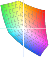
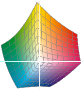
The RGB system happens to be able to produce far more colours than the CMYK one. The graphics below show the range of colours available from a typical RGB device and those available from a typical CMYK device. As you can see, many of the bright colours available in RGB are impossible in CMYK. This is why a bright green on your computer, say, will look a lot duller when printed.
There are ways to improve this situation, perhaps by using spot colours such as PANTONE or special printing presses that use more than just the CMYK inks, but the cost can increase substantially.
Fact 3: Even with consistent a colour mode, colours can vary.
Desktop printers may use different combinations of inks to CMYK. Commercial printer A may buy their yellow ink from one source and printer B from another source, resulting in a slightly different shade. Plus, the paper the ink falls onto can have a significant effect.
On screen, the hardware displaying the red dots may produce a very bright light on one screen but be more dull on another. In addition, the light in the room where you’re viewing the screen has an effect.
So, the graphs of colour range (‘gamut’) shown above are just typical examples and will vary slightly from device to device.
Conclusion
If you view something on-screen, don’t expect it to look identical when it comes back from the printer’s. Don’t expect something to look the same on all computer screens, nor on all prints.
The only way to know exactly what a print will look like is to get a sample from the printer.
More information
A question might be: why can’t monitors use CMYK, or printers use RGB, so that monitors and printers are more consistent with each other? The answer is because RGB relies on light combining to produce colours, whereas CMYK relies on light reflecting to produce colours. If you combined red/green/blue together on a screen you get white; if you did the same on paper you get black (ish). The two colour models are the opposite to each other so whilst screens shine light and paper merely reflects it, there will always be this difference.
If screen and print colours differ so much, is there a way to make the screen simulate what the final print will look like? This is where colour management comes in, and is a whole topic in itself. Even then, there will still be some variation due to the different way in which colour is perceived on screen and in print.
This post doesn’t explain the concept of light reflecting into our eyes and why mixing colours together produces other colours. For further information on colour theory try the Wiki page.
When specifying RGB colours, the intensity of each red, green and blue dot is normally expressed as a value between 0 and 255. 0 is off, 255 is on fully. That’s 256 intensities per colour, or 256×256×256=16,777,216 total colours. We’re counting pure black as a colour here, although technically it’s not anything. This range of colour is also called ‘24-bit’, because 224=16,277,216. In Photoshop this amount of colour is referred to as ‘8 bits/channel’ because 8 bits each of red, green, and blue equal 24 in total. Some screens can actually display more than this and Photoshop allows you to work with up to 32 bits/channel, i.e. 232+32+32=7.923e+28 colours! Although this vast range can be useful whilst manipulating images, in the end the human eye can’t differentiate between so many anyway — nobody seems to know for sure but seven million seems to be guessed at quite a lot.
Digital cameras and scanners also work in RGB mode.


